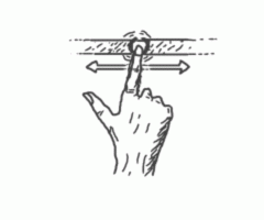
Lists are no doubt one of the most-frequently used components in mobile application development and they have become more powerful than ever with the swiping feature. Creating powerful things in flexible environments becomes more and more fun. For illustration of how it works, see the figure below:
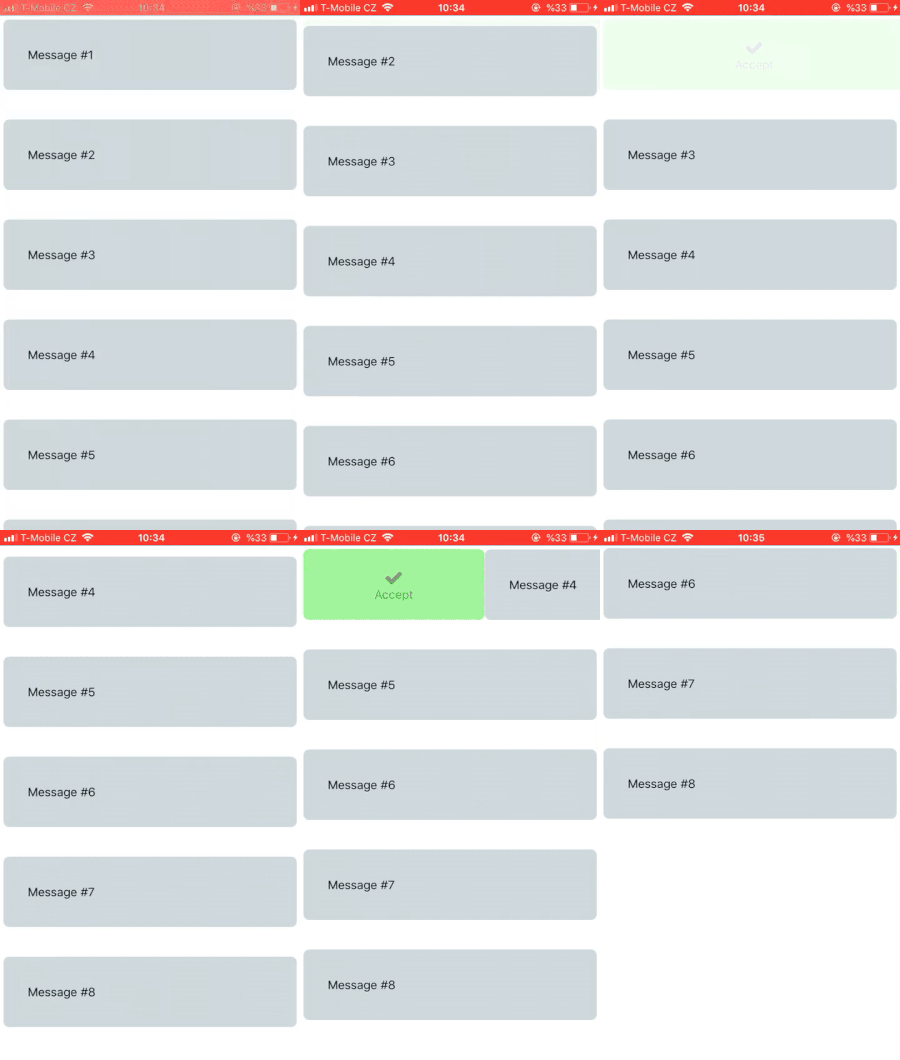
React Native doesn’t have a built-in swipeable list component but there are good solutions for swipeable lists such as React Native Swipeable. They are all ready to plug & play. However, there will definitely come a day when there is nothing available to meet your exact need. It is, therefore, always better to learn what is going on behind the scenes and which or how specific parts are used. It is not an easy problem and there are details to keep an eye on.
After this article, you will be able to create your own swipeable list and ready better than ever for future challenges. So, fasten your seat-belts! =)
The swipeable list will have 2 main components: a container and list items. Let’s call the container List. List class is responsible for holding and rendering your data.
This is the structure you use in a swipeable list :
  <List>
      <Item />
      <Item />
  <List />
PREREQUISITES
This guide is intended for people who already know,
- React Native Development
- Component Lifecycle in React
- Props
- Styling
- Layout with Flexbox
If you are a complete beginner you can read the getting started page or react native express, which talk about all the fundamentals you need to know before going further.
Also we need to import react-native-elements to our project.
Finally, we suggest that you test the application with real devices to display animations correctly.
You can access the whole project on GitHub.
BEFORE YOU ANIMATE
List Component
Needed imports in List component;
     import {
       ScrollView,
        LayoutAnimation,
    } from 'react-native';
ScrollView is simply the component to encapsulate your items when they do not fit in screen and you want the user to be able to scroll up and down on items. LayoutAnimation will be covered in the next stages.
Here is state of List component.
  state = {
      data: this.props.data,
      swiping: false
  }
Since you want our component to be reusable, you get data from the parent class via props that will use List. The List component also has another property ‘swiping’. The use of ‘swiping’ will help you detect if the user is swiping an item right or left. You need to know this because once the user starts swiping items, you are supposed to disable the scroll view to avoid mixing the animations.
List Items Described
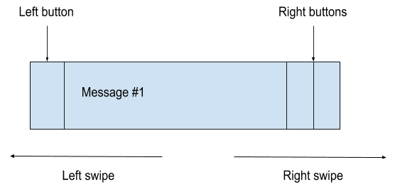 The drawing you see above is the core component of our application called the Item. You have mostly text in them, but it can be virtually anything. The core component is going to contain most of our animation tricks and the points we need to make an effort to understand.
I am sure you have already started wondering what kind of logic there is behind that core component. No need to wait; once the user swipes right, an "accept" button will show up on the left. The user can either press the button to accept or continue swiping to activate the same button and then the item is accepted and removed from the list. However, while swiping left, the user won’t have any options to swipe all the way to activate buttons. He or she can only press those buttons which will be shown . This is because you wanted more extensive logic in your demo app. Of a course tinder-style app could only do with 2 actions, hence full swipes.
A long story short, a left swipe opens the right buttons and a right swipe opens the left button.
Composing Items in List
You have the ‘renderItems‘ method which will map the data and create the
  renderItems() {
    return this.state.data.map((item) => {
        return (
            <Item
            key={item.id}
            swipingCheck={(swiping) => this.setState({ swiping })}
            message={item.message}
            id={item.id}
            cleanFromScreen={(id) => this.cleanFromScreen(id)}
            leftButtonPressed={() => console.log('left button pressed')}
            deleteButtonPressed={() => console.log('delete button pressed')}
            editButtonPressed={() => console.log(‘edit button pressed’)}
            />
            );
        });
  }
Now, let’s talk about some of the properties you are passing to the
- ‘key’: Key is obligatory to pass if you are creating a list of items.
- ‘swipingCheck’: This property will help you change the state once the user starts and stops swiping.
- ‘message’: The message which will be shown on
- .
- ‘cleanFromScreen’ : This function will clean the item from the screen based on the given id.
- ‘leftButtonPressed: The function which will be triggered after the user swiped to the right or pressed the left button.
render method of List is responsible for showing the current data in a ScrollView.
   render() {
      return (
          <ScrollView
           scrollEnabled={!(this.state.swiping)}
           >
            {this.renderItems()}
           </ScrollView>
      );
   }
The reason to have scrollEnabled property becomes clearer with the render method. If a user swipes, you change the scrollEnabled property of scroll view. This prevents the screen from moving in multiple directions.
So far, we have talked about showing items on the screen. As the next step, you will need a method to remove an item from the screen after the user swipes a list item, so let’s create one.
   cleanFromScreen(id) {
       const data = this.state.data.filter(item => {
       return item.id !== id;
    });
    this.setState({ data });
   }
Each item in the list will have cleanFromScreen method and they will be able to pass their id’s. Once you have the swiped item’s id, you just remove it from all data. So, it’s time to change the state and after changing it, the render method will be called with new items to show.
ANIMATING THE ITEM
Item Component

Needed imports in Item class ;
  import {
        View,
        Text,
        Dimensions,
        Animated,
        PanResponder,
        TouchableOpacity,
        Easing,
        StyleSheet
   } from 'react-native';
Brief Explanation of the Animation-Related API’s
Before we go further, I want to talk about 2 important points.
Animated API: Since you want to move items on screen, you need something dynamic to move our components. The Animated API is just perfect for handling movements and animations easily.
Three fundamental steps of applying Animated API
- Assign a value that the animation will progress with
- Determine what type of animation will be applied
- Wrap the component to be animated
Now we will apply all the steps to the item to get it moving.
PanResponder: You don’t only want items to move on their own. What you want is to detect user gestures and move the items based on these captured gestures. Therefore, PanResponder is another API created by React Native to watch user gestures. PanResponder has also lifecycle methods to manage gestures. Now let’s discuss how we can integrate this gesture lifecycle to our component.
It’s always better to see what the creators say so just dip into React Native documents.
To sum up, PanResponder will catch the gestures and the Animated API will move the component based on those gestures.
Constructor of Item Component
First, I want to show you the whole constructor and then I will explain the code in steps.
  constructor(props) {

      super(props);
      const position = new Animated.ValueXY(0, 0);
      this.scrollStopped = false;

      const panResponder = PanResponder.create({
          onStartShouldSetPanResponder: () => false,
          onMoveShouldSetPanResponder: () => true,
          onResponderTerminationRequest: () => false,
          onPanResponderGrant: () => {
              this.position.setOffset({ x: this.position.x._value, y: 0 });
              this.position.setValue({ x: 0, y: 0 });
        },
        onPanResponderMove: (event, gesture) => {
            if (gesture.dx >= SCROLL_THRESHOLD) {
                this.enableScrollView(true);
                const x = gesture.dx - SCROLL_THRESHOLD;
                this.position.setValue({ x, y: 0 });
            } else if (gesture.dx <= -SCROLL_THRESHOLD) {
                this.enableScrollView(true);
                const x = gesture.dx + SCROLL_THRESHOLD;
                this.position.setValue({ x, y: 0 });
            }
        },
        onPanResponderRelease: (event, gesture) => {
            this.position.flattenOffset();
            if (gesture.dx > 0) {
                this.userSwipedRight(gesture);
            } else if (gesture.dx < 0) {
                    this.userSwipedLeft(gesture);
            } else {
                this.resetPosition();
            }
        },
        onPanResponderTerminate: () => {
            Animated.spring(this.position, {
                toValue: { x: 0, y: 0 }
            }).start();
        }
    });

    this.position = position;
    this.panResponder = panResponder;
}
Let’s explain every line we coded.
1) Declaring position value
  const position = new Animated.ValueXY(0, 0);
  this.scrollStopped = false;
Do you remember the 3 steps of Animated API ? This is the first step. Here you define the position of the component that will be moving. You set the initial x, y values at 0, 0.
You also define another variable to keep scrollView’s availability. We will discuss this variable in onPanResponderMove property.
2) Should the PanResponder respond to touches ?
onStartShouldSetPanResponder: () => falseWith this property, you tell the PanResponder not to respond to single touches.
3) Should the PanResponder respond to movements ?
onMoveShouldSetPanResponder: () => trueWhat you want is continuous finger movements as swiping so you set PanResponder to respond to those gestures.
4) Blocking termination requests
onResponderTerminationRequest: () => falseIf any other components want to be responded to, you do not let them because your animation has priority.
5) PanResponder has started responding
  onPanResponderGrant: () => {
      this.position.setOffset({ x: this.position.x._value, y: 0 });
      this.position.setValue({ x: 0, y: 0 });
  }
PanResponder now starts to respond to events, so it’s a good place to put initial values. Let’s imagine that the user swiped the item to the x : 50 and finished the movement. Do you want your item to go its initial position x: 0 or do you want it to start moving from its last position? You want it to continue movement from its last position for sure. So, you take x : 50 as an offset, then the user can start swiping from the previous position. After setting the offset, you clean the position for new gestures.
6) User is moving his finger
  onPanResponderMove: (event, gesture) => {
    if (gesture.dx >= SCROLL_THRESHOLD) {
        this.enableScrollView(true);
        const x = gesture.dx - SCROLL_THRESHOLD;
        this.position.setValue({ x, y: 0 });
    } else if (gesture.dx <= -SCROLL_THRESHOLD) {
        this.enableScrollView(true);
        const x = gesture.dx + SCROLL_THRESHOLD;
        this.position.setValue({ x, y: 0 });
    }
 }
This is the property where the fun starts because now the user starts moving the finger. Before going further, there are also some predefined constants that are used here.
    const SCREEN_WIDTH = Dimensions.get('window').width;
   const SCROLL_THRESHOLD = SCREEN_WIDTH / 15;
The threshold is the limit that helps us understand if the user really wants to swipe the Item. It is because the user could scroll up and down with skewed angle and the Item is not supposed to move in that situation. Furthermore, it is usually better to have constants according to changing phone features. Thus, you create the threshold proportional to screen size with the help of Dimensions.
Our onResponderMove function optionally gives us 2 parameters: event and gesture. You will use gesture to have the information about the user’s gesture. Have a look at gesture object and see what it contains:
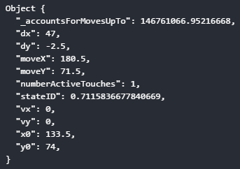 We will only use dx and dy meaning that change in x or y directions.
After some clarification, you can go on with onPanResponderMove. See the first if statement, if the user moves the finger on +x axis and passes the threshold, you want to move your Item. At first, we tell the scroll to stop with a method called enableScrollView.
   enableScrollView(isEnabled) {
    if (this.scrollStopped !== isEnabled) {
        this.props.swipingCheck(isEnabled);
        this.scrollStopped = isEnabled;
      }
    }
Why don’t we just call the swipingCheck method to change the swiping in List? It is because the onPanResponderMove is triggered by any movement of the user. Therefore, if we directly used the swipingCheck, the render method of List would be invoked with any movement and this would cause issues with the performance and thus affect smoothness. The scrollStopped holds the same value with the swiping in List when the scrollStopped has a different value then swiping then we call the swipingCheck method to change the actual state swiping. Let’s visualize it:

Let’s see how the animation would be seen without the line below:
const x = gesture.dx - SCROLL_THRESHOLD;
If you directly give the gesture.dx value to position value, the item teleports to the threshold coordinate. It is because you have a control there that checks if the user gesture on x direction is greater than or equal to the threshold. By the time the gesture on x direction passes the control, it already has a value same as the threshold. Say 35. Now we detect that “yes, the user wants to move the item right”. If you just give the gesture the value to the position, it will immediately teleport to the x : 35 like gif. And therefore, at first you need to subtract the threshold value from the gesture, then you can add it to the position.
this.position.setValue({ x, y: 0 });The last line of onPanResponderMove is above. It is literally the line where we connect our Animated API and PanResponder. You change your position which is an Animated.ValueXY based on the value which is coming from the gesture caught by PanResponder.
7) User stopped touching
 onPanResponderRelease: (event, gesture) => {
    this.position.flattenOffset();
    if (gesture.dx > 0) {
        this.userSwipedRight(gesture);
    } else {
        this.userSwipedLeft(gesture);
    }
 }
The onPanResponderRelease is a property that is triggered once the user removes the fingers from the screen. The first thing you do is call flattenOffset method for position.
You set the offset before and now it is the right time to add the offset value to our animated value. For that reason, you call here the flattenOffset function. It also resets the offset to 0 and prepares the offset for new values.
You can check the definition for flattenOffset function in Animation Book which is a great source for understanding the Animated API deeply.
Second, you decide if the user swiped left or right. Then you call the corresponding method for the direction. Let’s discuss the userSwipedRight method and some predefined constants used by it.
  const FORCE_TO_OPEN_THRESHOLD = SCREEN_WIDTH / 3.5;
  const LEFT_BUTTONS_THRESHOLD = SCREEN_WIDTH / 7;
As you see, we again declare our thresholds based on the SCREEN_WIDTH.
 _left_buttonthreshold
 _force_to_openthreshold
 userSwipedRight(gesture) {
    if (gesture.dx >= FORCE_TO_OPEN_THRESHOLD) {
      this.completeSwipe('right', this.props.leftButtonPressed.bind(this));
    } else if (gesture.dx >= LEFT_BUTTONS_THRESHOLD && gesture.dx < FORCE_TO_OPEN_THRESHOLD) {
        this.showButton('right');
    } else {
      this.resetPosition();
    }
 }
The first condition you check is shown in the second gif above. If the gesture is greater than the FORCE_TO_OPEN_THRESHOLD, you call the completeSwipe method
completeSwipe basically takes the component out of the screen when it is required.
const FORCING_DURATION = 350;That variable you define here is being used in completeSwipe.
  completeSwipe(dimension, callback) {
     const x = dimension === 'right' ? SCREEN_WIDTH : -SCREEN_WIDTH;
      Animated.timing(this.position, {
        toValue: { x, y: 0 },
        duration: FORCING_DURATION
     }).start(() => this.props.cleanFromScreen(this.props.id));
     callback();
  }
This function takes 2 parameters. One of them is the dimension of movement and the other is the callback function that is going to be called after the swipe is completed. I did not pass any specific functions to callback. However, in real cases you need to do something if the user completes a swipe. Therefore, you can use that callback to pass functions.
This method is another example of the second step of an Animated API because you again decide here how the item will move with Animated.timing. As the first parameter you pass the value that you want changed and as the second parameter you set an object that contains the target value which is the end of the screen and the duration for the animation. In the timing method you can also set a callback function like we do here with cleanFromScreen. It gets called when the animation ends.
showButton helps us put the component at a position where buttons can be seen.
  showButton(side) {
      const x = side === 'right' ? SCREEN_WIDTH / 4 : -SCREEN_WIDTH / 2.5;
      Animated.timing(this.position, {
          toValue: { x, y: 0 },
          duration: 400,
          easing: Easing.out(Easing.quad)
      }).start(() => this.enableScrollView(false));
  }
In the other condition of the if statement in userSwipedRight you detect that the user didn’t swipe enough to force swiping but enough to open the left button. Then you call the showButton method, which moves the component enough to show buttons according to the given side parameter. Furthermore, there is a different line easing: Easing.out(Easing.quad) With that line you add easing to your animation. You can read more details about easing on React Native Docs and also see the visual effects on Easing.net.
If the user couldn’t pass both of the thresholds, you basically call a method, namely the resetPosition to put the item to its starting position.
  resetPosition() {
    Animated.timing(this.position, {
        toValue: { x: 0, y: 0 },
        duration: 200
    }).start();
  }
If another view somehow ( scrollView in our case ) gets the responder on itself, onPanResponderTerminate is called. Therefore, our animation would stay uncompleted in such a case and we make it return its initial position with Animated.spring. It is also another Animated API method that creates bounce effect.
8) If somehow our animation is interrupted
onPanResponderTerminate: () => {
Animated.spring(this.position, {
toValue: { x: 0, y: 0 }
}).start();
}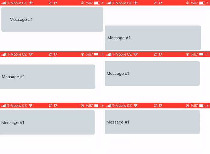 without onPanResponderTerminate
 with onPanResponderTerminate
As you can see in the first gif, whenever the responder is taken from your Item, it just stays in the middle. However, the one that has the Animated.spring method in its onPanResponderTerminate, it takes the Item to its initial position.
STYLING
Item Styles
To make it easy to visualize, let me show you the structure you use in your Item
    <View style={containerStyle}>
    <View style={leftButtonContainer} />
    <View style={textContainer} />
    <View style={rightButtonContainer} />
    </View>
Let's start with containerStyle
 1)  containerStyle: {
       flex: 1,
       flexDirection: 'row',
       marginBottom: 5,
       marginHorizontal: 5,
       marginTop: 30,
       elevation: 3
     }
The important property you have to pay most attention to is the flexDirection: 'row' because you want to arrange child components as rows.
 2)  textContainer: {
        width: SCREEN_WIDTH / 1.03,
        paddingHorizontal: 30,
        paddingVertical: 35,
        borderRadius: 7,
        backgroundColor: '#CFD8DC',
        elevation: 3,
        zIndex: 2
     }
You want your textContainer to fill the row it sits in, that's why we have the width property. Another important point is zIndex: 2. The zIndex helps you define the layer of component. The trick you will use for the buttons on the right is just playing with the layers. The right buttons will be under the textContainer and if you swipe textContainer to the left, they will appear. Don’t forget that the higher zIndex always stays on top.
 3) rightButtonContainer: {
      position: 'absolute',
      left: SCREEN_WIDTH / 1.24,
      alignItems: 'center',
      justifyContent: 'center',
      marginRight: 5,
      borderRadius: 7,
      paddingHorizontal: 18,
      paddingVertical: 23,
      elevation: 3,
      backgroundColor: '#D50000',
      zIndex: 1
 }
You use the position: 'absolute' here because you want the right button to stay at the same position with its parent. As we mentioned before, the zIndex: 1 will take the right button to the down layer and if you move the textContainer, it is going to be seen. You will also assign some style properties to the rightButtonContainer dynamically.
 4)   leftButtonContainer: {
        alignItems: 'center',
        justifyContent: 'center',
       marginRight: 5,
       borderRadius: 7,
       paddingHorizontal: 18,
       paddingVertical: 23,
       backgroundColor: '#50f442',
       position: 'absolute',
      elevation: 3,
    }
You will assign some properties to the leftButtonContainer dynamically as you will do to the rightButtonContainer.
Dynamic Item Styles with Interpolation
1) For right buttons
 getRightButtonProps() {
    const opacity = this.position.x.interpolate({
        inputRange: [-SCREEN_WIDTH, -120, -35],
        outputRange: [0, 1, 0]
    });
    return {
        opacity,
    };
  }
What you do is simply get an output value based on the x value of the position. The inputRange and outputRange help us set borders for values. For example, if the x of position becomes -35, opacity will be 0. If x gets closer to -120 meaning that the user is swiping to the left, opacity will be closer to 1.
It would definitely work without changing the opacity because the right button is already on a lower layer and moving the textContainer which is on the top layer will produce a good animation effect but not as smooth as playing with opacity. Let’s see the difference.
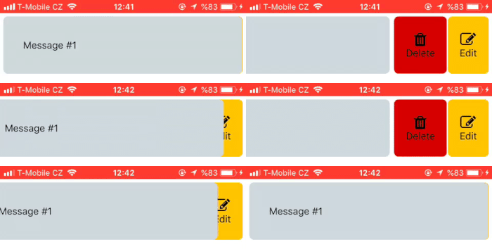 Without interpolation of position for opacity
 With interpolation of position for opacity
2) For left button
  getLeftButtonProps() {
    const opacity = this.position.x.interpolate({
        inputRange: [35, 75, 320],
        outputRange: [0, 1, 0.25]
    });
    const width = this.position.x.interpolate({
        inputRange: [0, 70],
        outputRange: [0, 70]
    });
    return {
        opacity,
        width
    };
  }
This time you are interpolating x of position 2 times. You could even interpolate x for 5 different values. Here you only change opacity and width but changing rotation, colour and scale of an item is also possible with interpolation. The question coming to your mind must be: why do you change the width this time? It’s because you want a situation like the left button is following the textContainer. You could also assign the left button a hardcoded value but that wouldn’t seem so smooth. Let’s assign the same hardcoded width value with textContainer and see the difference.
 Without interpolation of position for width
 With interpolation of position for width
RENDER METHOD OF ITEM
Now there is one part left which is the render method of the Item component. Before telling you about the render method, I want to remind you of something we have covered before. It is the 3rd step of Animated API that wraps the animated tags. You have specified so many properties for components so far. Now it’s time to specify which component will use those properties.
As you saw in the gifs, you just move the textContainer. Therefore, do you really need to watch the buttons if the user swipes or touches them? The answer is no. You just need to watch the user gestures on the textContainer. You need to attach that line as property to the component you want to watch.
{...this.panResponder.panHandlers}This is significant because without that line we cannot watch gestures. Here is your render method :
  render() {
    const { containerStyle, leftButtonContainer, textContainer, rightButtonContainer } = styles;
    return (

        <View style={containerStyle}>

            <Animated.View  // Left Button
            style={[leftButtonContainer, this.getLeftButtonProps()]}
            >

                <TouchableOpacity onPress={() => this.completeSwipe('right', () => this.props.leftButtonPressed())}>
                    <Icon
                        type="font-awesome"
                        name="check"
                    />
                    <Text
                        style={styles.textStyle}
                        numberOfLines={1} // to keep the text in one line when it the container gets narrow
                        ellipsizeMode='clip' // to show the text without three dot but works only on iOS and crashes on android
                    >
                        Open
            </Text>
            </TouchableOpacity>

            </Animated.View>

            <Animated.View // The content of item aka  textContainer
                style={[textContainer, this.position.getLayout()]}
                {...this.panResponder.panHandlers}
            >
                <Text style={styles.textStyle}>{this.props.message}</Text>
            </Animated.View>

            <Animated.View // Left Button  1
                style={[rightButtonContainer, { left: SCREEN_WIDTH / 1.7 }, this.getRightButtonProps()]}
            >
                <TouchableOpacity onPress={() => this.completeSwipe('left', () => this.props.deleteButtonPressed())}>
                    <Icon
                        type="font-awesome"
                        name="trash"
                    />
                    <Text style={styles.textStyle}>Delete</Text>
            </TouchableOpacity>
            </Animated.View>

            <Animated.View // Left Button 2
                style={[rightButtonContainer, { backgroundColor: '#FFC400' }, this.getRightButtonProps()]}
            >
                <TouchableOpacity onPress={() => this.props.editButtonPressed()}>
                    <Icon
                        type="font-awesome"
                        name="edit"
                    />
                    <Text style={styles.textStyle}>Edit</Text>
            </TouchableOpacity>
            </Animated.View>
        </View>
    );
  }
 }
The structure is just like we have discussed before but there are a few things new:
  <View style={containerStyle}>
    <Animated.View style={[leftButtonContainer, this.getLeftButtonProps()]} />
    <Animated.View
        {...this.panResponder.panHandlers}
        style={[textContainer, this.position.getLayout() ]}
    />
    <Animated.View style={[rightButtonContainer, this.getRightButtonProps()]} />
 </View>
We have wrapped the components with Animated tags that we want to animate and attached the {...this.panResponder.panHandlers} line also known as the panHandlers to the component you want to get gestures from. You also call the property methods to get interpolated properties for components.
Another detail I want to emphasize is that in textContainer we have used a method named the getLayout(). This method brings us the current position values, so we can see the textContainer moving. It is basically the same thing with the following:
    <Animated.View style={{
           top: this.position.y
           left: this.position.
     }  />
Instead of using such a long expression to get the current position values, use what was provided to you by React Native:
<Animated.View style={this.position.getLayout()} />PUTTING IT ALL TOGETHER
Everything seems ready. Let’s create App.js file. Here are some test values.
    import React from 'react';
    import List from './src/components/List';

    const DATA = [
        { id: 1, message: 'Message #1' },
        { id: 2, message: 'Message #2' },
        { id: 3, message: 'Message #3' },
        { id: 4, message: 'Message #4' },
        { id: 5, message: 'Message #5' },
        { id: 6, message: 'Message #6' },
        { id: 7, message: 'Message #7' },
        { id: 8, message: 'Message #8' },
    ];

    export default class App extends React.Component {
        render() {
            return (
                <List data={DATA} />
            );
        }
    }
If you have been coding all the way with me, you must get an output like below.
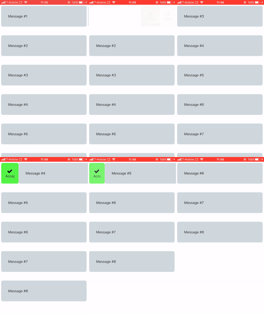
It seems like a problem occurs if the item is gone. It’s because the List component suddenly renders the items without any animation. Therefore, if you add some animations to the lifecycle method componentWillUpdate which is called when component gets a status update, it will look smooth and professional.
You will use LayoutAnimation which you imported at the beginning. The docs read: “LayoutAnimation : Automatically animates views to their new positions as the next layout comes up.” If you want to learn more about it, go to: LayoutAnimation.
Add that lifecycle method to List;
    componentWillUpdate() {
        LayoutAnimation.spring();
        UIManager.setLayoutAnimationEnabledExperimental && UIManager.setLayoutAnimationEnabledExperimental(true);
    }
![Whole swipeable list with layout animation]/var/assets/template_images/blog/react-native-swipeable-list/withLayoutAnimation.gif)
Now it seems professional and smooth.
CONCLUSION
We have covered how a swipeable list can be created in React Native in a lot of detail. I hope the article has inspired you and you are ready to create your own swipeable list component.
I also encourage you to add more improvements such as showing the preview of a message whenever the user holds the message for more than 2 seconds. Thank you for reading and accompanying me on this long journey!

