
In the first part of this series, we already defined what parts of the site we need to optimize and covered two of them:
- Network part - everything concerning data flow on the network between your web server and your visitor.
- Main document part - mostly concerning TTFB issues encountered when WordPress is preparing the website HTML code to be served to the visitor.
There is a third part that I want to cover in this article, generally called a “front-end” part. Plainly speaking, it is about processing the HTML code sent to the browser and the activity following directly after. We will start by analyzing the processing in detail. Then two groups of optimization strategies will be covered: template optimizations and improved asset loading.
Quick explanations of the keywords used, in the context of WordPress:
- By templates we mean the HTML sources your page is rendered from. In the case of WordPress, this is mostly present and can be influenced directly in your theme code, sometimes through 3rd party plugins.
- By assets, we mean any resource requested over the network when your web page is loading (aside from the main document) - individual files of various types. In WordPress, these are usually part of your theme, plugins, or uploaded media. We further divide assets into Text file types and Data file types, from which we discuss images in this article.
How the HTML is processed
Based on your experience, there is a good chance you heard the term Critical Rendering Path at least once. Let’s start by explaining it.
When your visitor opens your web page and the Main Document Part (the HTML code of the page) is loaded into the browser, several steps start to happen.
First, a Document Object Model (DOM) starts building. Basically an object-like representation (because developers like their data described as objects) of the page structure, a hierarchical tree containing your HTML elements. As enough data for styles of the page are obtained, a CSS Object Model (CSSOM) is built separately. These two are combined into a Render Tree, describing what will actually be outputted, and this is further processed by Layout, which adapts rendering to the current viewport (window size and device capabilities). Only then is content finally outputted in the form of pixels in a step called Paint in the browser’s jargon.
Now, why is that important? Because several types of assets, tagged Critical Resources, are render-blocking, meaning they must be loaded and processed before Render Tree is a go. We are especially concerned with two client-side asset types, CSS and JavaScript.
With CSS, this applies: by default, all CSS files or inline styles referenced/located on a page must be processed before rendering (in other words, CSSOM must be finalized first).
Side Note here: If CSS were to behave as non-blocking, it would be applied separately during several consecutive renders and you would experience what we call a “FOUC” - Flash of Unstyled Content. Not good for UX. And sometimes this really happens, most often caused by non-standard style implementation (such as adding styles through JavaScript).
With JavaScript, things get more complicated. By default, any JavaScript code, either inline in the document, or referenced from an external asset:
- stops the rendering of the page when processing reaches its location in the HTML document,
- executes the script’s code,
- resumes processing of the rest of the HTML document.
With lots of external scripts, this can lead to significant pauses when loading the web page. We’ll discuss optimizations for this in the following chapter.
Technical detail here: As the browser reaches a JavaScript code or external script (and loads it), it starts execution only if CSSOM is ready, otherwise it waits for it to finish first. It is not waiting on the DOM, however, meaning the JavaScript code has at its disposal a representation of the DOM available at the point of execution. That could trigger beginner-level errors such as scripts referencing elements that don’t exist yet. To make sure we work with a complete DOM in our scripts, we can define our application logic to be executed when the DOM is complete, usually by the means of listening to specific events.
So, back to our processing flow. We just rendered the page, right?
But our journey does not end here! According to our Core Web Vitals article, that is the open road to a successful Largest Contentful Paint (LCP) event. But as the article states further, this still means it could wait for a noticeable delay before the site is actually responding to user’s interactions, a delay which we can measure using First Input Delay (FID).
What is a noticeable delay? Even short pauses, like 0.3 seconds, are harmful, as the overall feeling is a certain “sluggishness” of the site. Psychologically, this is even more problematic than having a long 3-second wait on page load, as you have this “the website is stuck” experience in your head, and the primary reaction could be to run away from broken things.
Now that we understand how the rendering of the page works, let’s focus on improvements.
Optimizing templates
Critical Rendering Path optimizations are not always easy to understand. I suggest reading this set of guidelines provided by Google to learn more on the topic. Generally, this is the approach:
- putting stylesheet links into <head> to load them as soon as possible,
- limiting amount of files included, as every request has some cost even on HTTP/2,
- not using @import CSS declarations as they fire additional resource requests.
Technical detail here: Interestingly, styles limited to media queries which are not currently met (i.e. print or orientation:portrait) will not be treated as critical and hence do not block rendering. If you split your CSS into critical/non-critical parts following this logic, and even have your critical CSS as inline code (meaning no request to fetch it), it can be a very interesting optimization, however definitely not without some development cost. In CMS environments with a lot of 3rd party content, which WordPress is, this could be very tricky.
Regarding Javascript, there are 2 attributes we can use in our script tags, only for network-loaded JavaScript assets (not inline code) to mark it is not critical:
- async - tells the rendering cycle not to be blocked on this script. Such a script can be executed at any time when it loads in the future and goes in parallel with the rendering, with no guarantees,
- defer - also tells the rendering cycle not to block, with the added promise that it will be run only when DOM is fully ready. If your code depends on DOM ready event callbacks, these will be executed after deferred scripts.
Learning how to use these two attributes might provide a great boost to your templates, but you must really understand how they work exactly and prepare your code accordingly.
About the First Input Delay problem, significant FID is most commonly caused by excessive JavaScript code being called. It does not help that after a page renders a DOMContentLoaded event is dispatched. As mentioned above, a lot of the JavaScript logic is usually waiting in line just for that event to happen, causing a noticeable delay before everything is executed.
Eliminating FID is usually by the means of either reducing the JavaScript complexity or delaying the execution of non-important code for later. Sometimes, this just means removing one unnecessary JavaScript plugin, sometimes it can be a complete rewrite of the whole client-side logic.
As WordPress is concerned, the following will not be a big surprise: template optimization happens by the means of using properly crafted themes. If you use commercial themes, it is not difficult to end up with a particularly bad one in terms of optimizations. There are some starter themes such as GeneratePress that are built with performance in mind. Invest some time in researching themes and follow critical path rules if you build your own.
Optimizing Text File Assets
Text file assets in the web environment mostly consist of source files. There are several optimizations that can be applied to them and file loading, let’s explain them one by one:
- Minification - when text files contain programming language sources, we can rename variables, reduce whitespace characters and concatenate lines to conserve file size (without changing the function of the code). The effect relies on the type of source in question - can be up to 50% for JavaScript, but usually lower for Stylesheets or HTML. The reason is you can rename identifiers in JavaScript code to conserve space, whilst you are limited only to whitespace trimming in the other formats.
- Compression - used to lower file size during transfer, compression of textual files can conserve as much as 80% of the original size - in the web server space, a gzip or Brotli compression algorithm is employed.
- Concatenation - can be applied to reduce the number of files. Source files usually work the same when joined together (with a few exceptions) and as we stated above, critical path optimizations rely on minimizing the number of network requests. This is somewhat negated by the use of the HTTP/2 protocol. Sometimes this is also counterproductive, as specific policies like media-specific stylesheet files, or situations in which we need to mix different JavaScript loading policies (synchronous/asynchronous) would not benefit from concatenated sources.
Table 1 summarizes a comparison of how these three could be applied to different asset types. Using the Code Beautify tool we measured the results of minification on various file types. And by running Linux command-line tools gzip and brotli, compression savings were analyzed (these are just illustrative and could be slightly off from the web server compression results). We have used our testing website from the first article - see Table 1 for source links.
| Source file type | Minification | gzip | Brotli | Concatenation |
|---|---|---|---|---|
| JavaScript | 52 % | N = 24 % M = 29 % |
N = 20 % M = 26 % |
Possible * |
| Stylesheets | 84 % | N = 11 % M = 12 % |
N = 10 % M = 10 % |
Possible ** |
| HTML | 91 % | N = 23 % M = 23 % |
N = 19 % M = 19 % |
Not possible |
| JSON | 96 % | N = 39 % M = 41 % |
N = 33 % M = 33 % |
Not possible |
| Manifest | 60 % *** | N = 49 % M = 70 % |
N = 35 % M = 46 % |
Not possible |
Table 1: Text file assets - usual optimization results comparison. Percents indicate the size of the optimized asset related to the original file (lower is better). For compression tests, M means "minified" and N means "non-minified" source.
Table 1 note explanations:
* = unless a specific order of synchronous/asynchronous scripts is required
** = unless we use media attribute on style tags, meaning we need specific CSS files for each
*** = relatively high gain in our measurement caused by excessive whitespaces in the file
Source files:
- HTML complete source of the homepage (this production version is actually using minification already, so an unoptimized version was tested instead).
- JavaScript - single unoptimized custom logic file from our theme.
- Stylesheets - outputted non-minified formatted theme file produced by WP Less plugin.
- Manifest - site manifest file from our custom theme.
- JSON - output of WordPress API resource, found and publicly available in the HTML source.
As compression of text sources is easy to achieve and relies mostly on proper server configuration, I highly recommend enabling it as soon as possible. Brotli is superior, so if there is a possibility it should be enabled in place of gzip.
Minification should be attempted especially on JavaScript files, other assets perform worse, as explained above. For example, you can use a build system such as gulp to produce an optimized version of the code after any changes to it. This also nicely teams with things like transpilers, polyfills or sourcemaps, to name a few tools of the modern JavaScript ecosystem.
File concatenation should be targeted at least for JavaScript and CSS files. As WordPress is concerned, the minification + concatenation strategy is easy for custom-made themes and their adjacent logic, which is ultimately the responsibility of the website developers. But in a shared environment like WordPress, 3rd party plugins or pre-built templates tend to ship with their own source files which are harder to control. It might actually help to try some of the caching plugins we already explored in part 1 - for example, W3 Total Cache offers treatment for all sources.
Optimizing Images
Images are the most-used media type by far, so we will focus the rest of this article on discussing them. The overall strategy is simple here: we need to lower the size of assets which are needed in order to display a webpage, leading to load time reduction. There are several tactics we usually employ to achieve this and we will cover each one in detail.
We already discussed most of these strategies in a separate article.
Proper image sizing
The most basic problem is we use images way larger than required at the exact place we display them on the website. The browser needs to load and process the full-size version and then scale it down before displaying, discarding a lot of unnecessary detail.
Hence sizing images properly, ideally before inserting them into the website, is the priority here.
But what if we have many different webpage instances on various devices? Sometimes we could use better detail on that fancy 5k Apple screen, sometimes we need a very small thumb-like image on a mobile phone in portrait mode.
The concept of responsive images helps here: we provide a number of image versions and the browser picks the most suitable one based on the properties of the device (available viewport size, pixel size). This is achieved by using HTML5 elements <picture> or via srcset attribute of the <img> tag. WordPress has built-in resize capabilities since version 4.4 which directly helps with generating responsive image versions from uploaded media.
Lazy-loading of images
If images are not needed in the current Paint step, they can be put aside and loaded when their time comes. This helps with the loading speed, especially on longer pages with lots of content. Lazy loading can be enabled via an attribute of the <img> tag or using JavaScript. This topic was already covered on our blog.
Image formats and compression
This is the important bit that can bear a lot of fruit if done correctly. Two rules apply here:
- We should choose a format fit for a given purpose (JPEG for photos, PNG for figures, SVG for low-detail shapes).
- We should employ modern image formats - especially WebP or AVIF.
The second rule is the most important given performance gains, and it was also already a topic on our blog. Utilizing modern formats means we have to take care of the conversion of website assets, as usually, it is tricky to force users to upload optimized versions. And we also need some help from the site to treat these images properly, offering fallback options to browsers not capable of processing them.
Testing image optimizers
In WordPress, a plethora of plugins exist with various capabilities regarding image optimization. In the practical part of this article, we tried to test several most well-known solutions and analyzed their performance. The above mentioned sample site contains 37 image resources, with several large already well-optimized JPEGs and a lot of accompanying PNG and SVG files of smaller size.
To limit the choices, several requirements were set before choosing the plugins:
- It should have a free plan (or at least a free trial).
- No CDN to display the images is needed = images are served from the website’s server.
- No special display treatment like adaptive image loading (several image versions loaded over time) is employed, for the tests to make sense.
- Built-in lazy loading can be disabled (again, for the tests to make sense).
Three major contenders meet these criteria:
All of them support:
- Image optimization on a remote server.
- Bulk processing of all assets in one go.
- Processing of WordPress media files, theme assets, and the ability to include custom folders.
- Resizing large images via custom set limits.
- Lazy loading (this was disabled for testing to obtain meaningful results).
All of them also allow to choose how to serve the optimized images:
- replacing original assets in webpage output via <picture> tags with WebP version served separately - does not work for assets like CSS backgrounds (so these load in their original formats),
- a so-called .htaccess mode - using server-side treatment to output optimized image directly when an asset is requested, keeping the original file name and changing the format. This allows all images to load in their optimized variant, no matter where located.
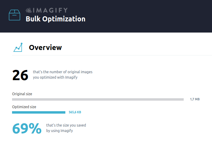
Imagify is mostly focused on compression optimization only, which is good if you are looking just for this particular feature. It can work with most existing media formats and even with PDF files. Settings are easy to understand and explanatory (Figure 1). Lazy loading is not supported directly. It has several quality settings, we have tested with Aggressive mode and observed no noticeable drop in visual quality. It has a free plan guaranteeing 20MB of processed images per month. For the paid plans see pricing.
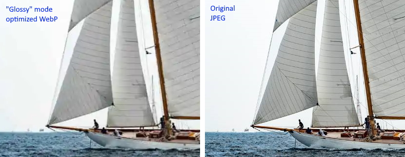
ShortPixel Image Optimizer is another contender. It is very similar in capabilities to Imagify. It is not oriented only to output WebP format, and also allows optimization in the native JPEG / PNG formats, or allows AVIF as a more performant WebP alternative. It does not support Lazy loading natively, but there is a very interesting plugin called ShortPixel Adaptive Images worth investigating. As for the quality, we have used Glossy settings in our tests, there are also 2 more options. A free plan is limited to 100 credits/month, where 1 credit roughly translates to 1 optimized version of the image. For paid plans see pricing.
However, two negatives were observed:
- visual quality in the recommended Glossy mode is noticeably distorted (See Figure 3),
- in bulk mode, the browser tab needs to be open before the operation finishes.
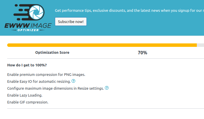
EWWW Image Optimizer is the third contender. It is very similar to the previous two, offering mostly the same advantages. It has quite a lot of options in two views (easy/advanced). However, with defaults (letting the optimizer decide on quality/size itself) it works very well, visual quality is very close to original images without visible distortion. It features a built-in lazy loading. As for pricing, EWWW Image Optimizer does not offer a free plan for the remote server scenario, it has a 1-month free trial and then you have to follow with a paid plan, see pricing. One negative side is a certain “sales pitch” communication style, but since this plugin is not meant to be used frequently when working with WordPress admin, it should not be a deciding factor. It allows for Easy IO CDN integration, which will be used to serve your images.
We have also tested two more optimizers, but they are disregarded from the results because the initial conditions could not be met - however, they are definitely an option to explore here:
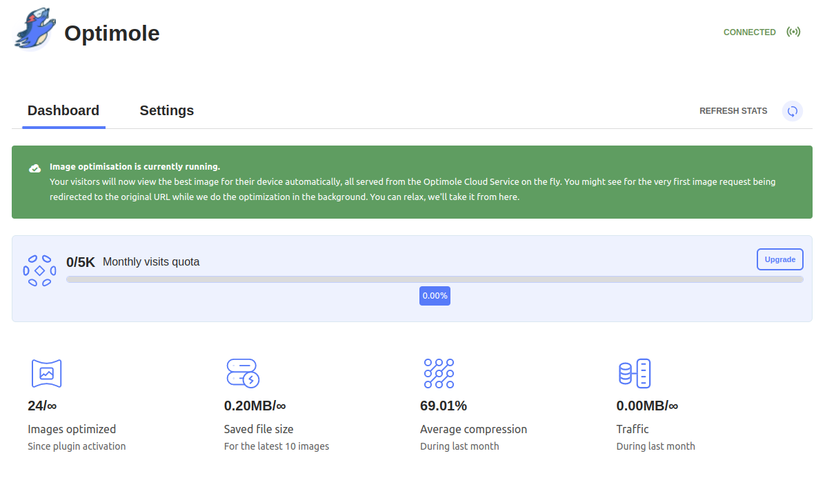
Image optimization & Lazy Load by Optimole is quite well known because of Optimole, a complete CDN for image asset optimization and serving. The plugin is mostly utilized as a connector to this CDN. It uses several powerful techniques, such as client-assisted lazy loading with automatic different quality assets serving, and it at least partially makes use of their CDN for image loading. Hence, it would be difficult to compare and we did not include it in our tests. Optimole has a free plan, limited to 5k visits monthly, see pricing for further options.
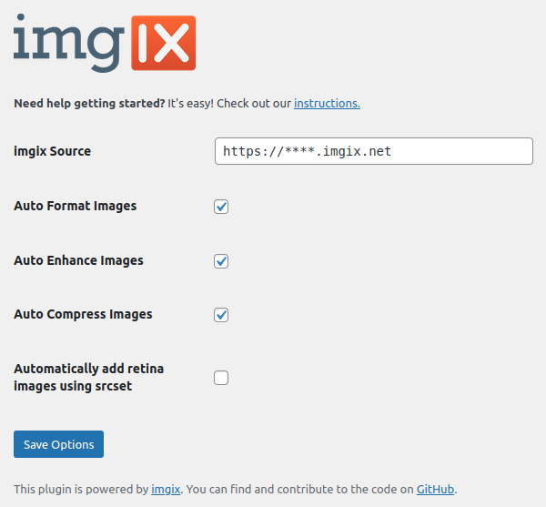
A plugin called Images via imgix falls into the same group, it is a connector to Imgix CDN, which has capabilities similar to Optimole. The plugin itself is not officially maintained and is very simple in nature (see Figure 6). A free plan is limited to 1.000 origin images monthly, see pricing for plans.
Test results
We observed 2 factors: asset file sizes and loading times. While asset sizes are fixed between page reloads, load times can vary depending on many factors - so we used a median of 10 uncached observations.
For asset file sizes, we also pinpointed the composition - the number of files and percentage of overall size in 4 formats we have been confronted with. This should give you an idea of how well the optimization worked. File formats are JPEG, PNG, SVG and WebP. Note: SVG is here just for completeness of the data, no plugin actually attempted to optimize SVG files.
| Plugin and configuration | Load time | Total size | JPEG Files % size |
PNG Files % size |
SVG Files % size |
WebP Files % size |
|---|---|---|---|---|---|---|
| Unoptimized | 931.5 ms | 1258.6 kB | 20 98.7 % |
7 0.5 % |
12 0.8 % |
0 0 % |
| Imagify - .htaccess mode | 673.5 ms | 784.8 kB * | 0 0 % |
0 0 % |
12 0.13 % |
25 98.7 % |
| Imagify - <picture> mode | 636.5 ms | 702.5 kB * | 3 71.3 % |
0 0 % |
12 1.5 % |
22 27.2 % |
| Shortpixel - original formats | 587.5 ms | 606.3 kB | 20 97.7 % |
7 0.6 % |
12 1.7 % |
0 0 % |
| Shortpixel - <picture> mode | 746.5 ms ** | 461.9 kB | 2 39.5 % |
0 0 % |
12 2.2 % |
23 58. % |
| Shortpixel - .htaccess mode | 648.5 ms | 434.5 kB *** | 0 0 % |
0 0 % |
12 2.4 % |
25 97.6 % |
| EWWW - .htaccess mode | 645.5 ms | 570.8 kB | 0 0 % |
0 0 % |
12 1.8 % |
25 98.2 % |
| EWWW - <picture> mode | 660 ms | 696.9 kB | 2 40.5 % |
0 0 % |
12 1.5 % |
23 58 % |
Table 2: Overall results of our tests.
Table 2 note explanations:
* = JPEG images beat WebP format here (explained below)
** = Load time in this mode is observably slower here - this is not a measurement error
*** = Smallest size is accompanied by the worst subjective image quality
Several key observations, as indicated by notes in Table 2:
Sometimes, JPEG beats WebP compression. Especially when origin images are already excellently optimized by automated tools, it could be tricky to achieve better file size using WebP. This was exactly the case for the Imagify plugin. Probable reasons are explained here.
<picture> mode is usually beaten by the .htaccess mode in all measured instances when load time is put in question. Probably because of the internals of the <picture> mode, some processing time is required to transform the output of the HTML, which in the case of Shortpixel using this mode has led to a significantly observable delay.
In terms of score, Shortpixel seems to have won achieving the best load time results and smallest file sizes. But this comes with significant degradation of image quality, as we stated above. A very good combination of savings and quality of the result was achieved by EWWW Image Optimizer, probably a winner of this short evaluation.
The most important result to take away from this, however, is the efficiency of these solutions. Most of them actually bring down the original total image size to half, accompanied by a visible drop also in load time. That demonstrates just how much optimizing images is important.
Conclusion
In part 2 of the WordPress Performance series, we discussed the front-end part and how it can be improved. I summarized the theory beyond it and offered ways to fix the issues, in the case of images accompanied by actual plugin tests and results. I hope this knowledge will help your WordPress website perform better. If there is a problem in WordPress, there is usually a plugin to solve it, but understanding how the bits and pieces fit together is important to compose the most effective solutions.
